Responsive Web Design
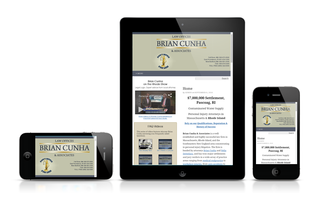
Responsive web design (RWD) is a web design approach aimed at developing web sites that work well across a wide range of devices (from desktop computer monitors to tablets and mobile phones). Ideally your site should be easy to read and navigate around with a minimum of resizing, panning, and scrolling. The ultimate goal of RWD is a single website, optimized for any screen size.
Why Develop A Responsive Site?
There has been explosive growth in mobile demand as consumers access online content on more devices — computers, smartphones, tablets, TVs, eReaders, and even gaming consoles.
According to the Pew Research Center, “Today nearly two-thirds of Americans own a smartphone, and 19% of Americans rely to some degree on a smartphone for accessing online services and information and for staying connected to the world around them — either because they lack broadband at home, or because they have few options for online access other than their cell phone.”
“64% of American adults now own a smartphone of some kind, up from 35% in the spring of 2011. Smartphone ownership is especially high among younger Americans, as well as those with relatively high income and education levels.”
— Pew Research Center
It’s important that your site deliver traditional Web (i.e., full-screen laptops and desktops with browsers) experiences alongside mobile experiences on a multitude of devices, each with different screen real estate and interaction methods.
How Do We Develop Responsive Websites?
Several things need to be taken into consideration when developing a responsive web site design. These are the three technical ingredients for responsive web design:
- Fluid Grids – Components in fluid grid designs flow and adapt based on the environment.
- Flexible Images – Images resize to fit the space allowed.
- Media Queries – Allow content rendering to adapt to conditions such as screen resolution.
In addition, to these technical approaches we need to consider designing content and pages for smaller screens and lower bandwidth. It’s easier to go small and build up to larger screen sizes rather than designing big and then reducing for smaller screen sizes. Also, it is helpful to determine what your users want when they are on the go and prioritize your mobile content based on that. It can make sense to flag certain content as mobile-only.
How Responsive Is Your Website?
Does your web site content resize itself depending upon the size of the device it is viewed with? Has your site been tested on a wide variety of devices to guarantee an optimal experience?
Customers are interacting with your business using their mobile devices — whether or not you have a mobile content strategy. To find out how your web site can be converted to a responsive site contact us for more information.
Endnotes
- Pew Research Center article April 1, 2015 by Aaron Smith “U.S. Smartphone Use in 2015”
- Tablets and smartphone use is growing among US online adults. See the January 4, 2011, “Tablets Will Grow As Fast As MP3 Players” report and see the March 9, 2011, “Crafting Products For The Next Smartphone Owners” report.